From Rigid to Flexible: Insurance Addition Revamp
Revamping a 2-year old feature can be challenging. Here's what I did.
2023
UI
UX
Case Study
Desktop
Overview
Over the course of early six months working at my current company, I was assigned to team Insure Space, a B2B dashboard that aimed at corporate policy holders and focuses on providing services for downloading policy information, participant information, submitting policy changes, paying premiums and submitting claims.
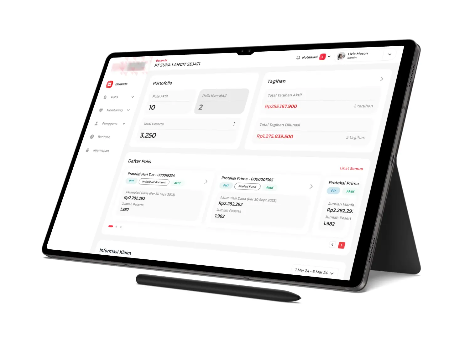
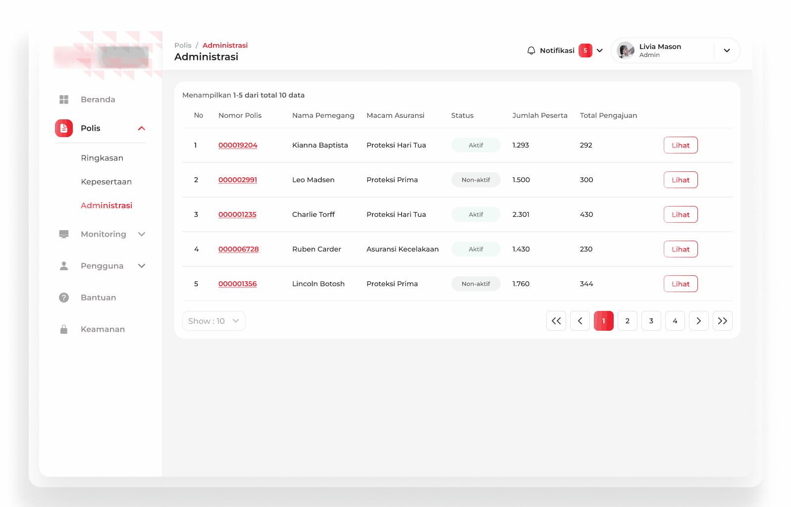
The application is primarily dashboard with features that can help PIC navigate through their company's insurance information, adding or removing member, and download billing invoice. Due to confidential issue, the application logo will be blurred, and all information regarding application name, policy names, policy holder and policy number have been pseudonymized.
Why We Need The Revamp?
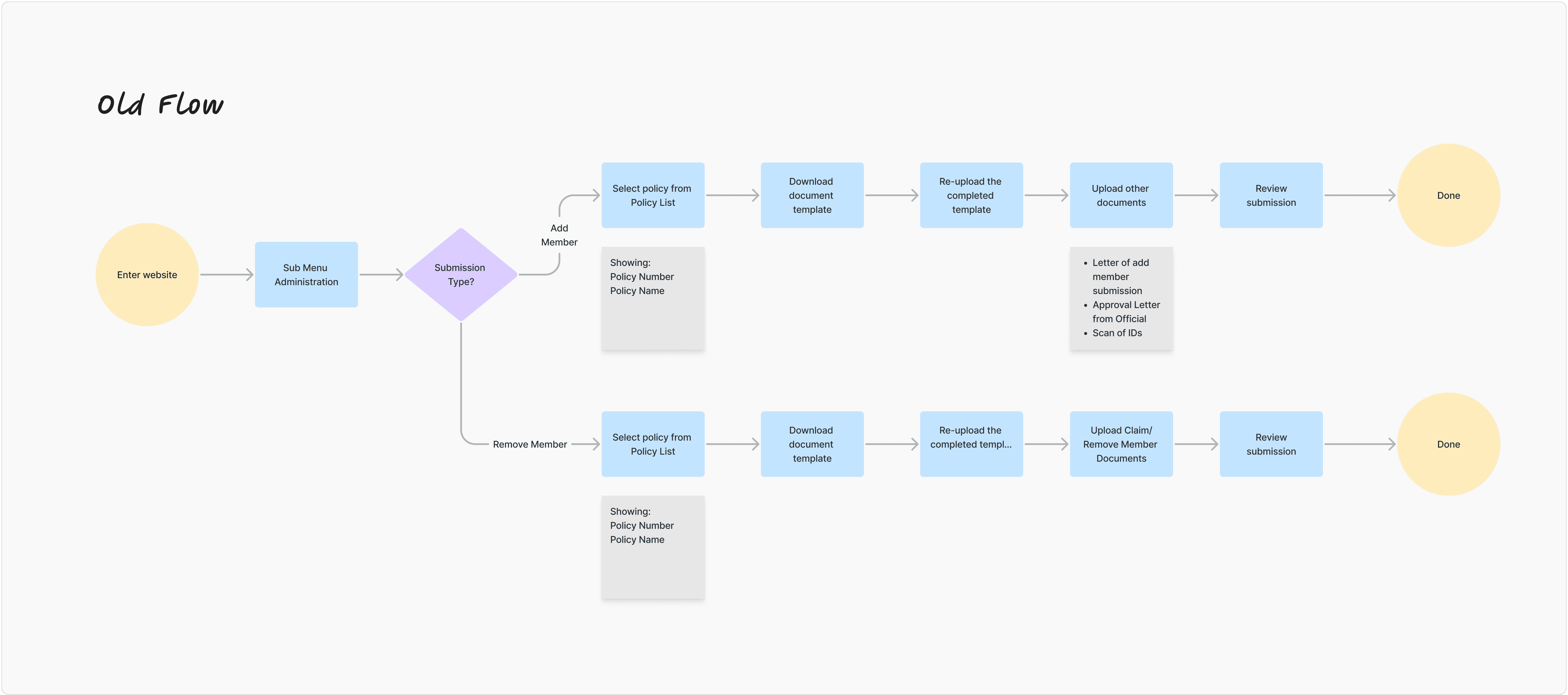
Apart from the fact that this task is a KPI achievement for the team, the revamp felt necessary because the previous flow felt long-winded and did not cover some of the information needed for certain insurance processes. For example, the old process (which was created over two years ago) required multiple redundant documents, making the process time-intensive and confusing to PIC.
Objectives
Streamline the submission flow by eliminating redundant documentation requirements
Improve user experience for company PICs to encourage feature adoption
Support team KPI of maximizing feature utilization through improved usability
Process
Before starting the design process, I collaborated with the Product Owner and Head of Business Product to analyze the existing flow. We discovered that the current approach (requiring PICs to upload multiple documents) created unnecessary friction through redundant documentation. Additionally, new business requirements emerged, including the ability to select multiple policies in a single submission, which made redesigning the flow necessary.
During brainstorming sessions, I explored various approaches through flow sketches and presented them to the team. Initially, I focused heavily on technical feasibility and backend processing requirements. However, through stakeholder feedback, I learned a critical lesson: prioritize user experience over operational convenience. This shift in perspective helped me design a flow that truly served the PIC's needs rather than just simplifying internal processes.
Design
The revamp's core innovation addresses two critical needs: accommodating different workflow preferences and reducing documentation burden.
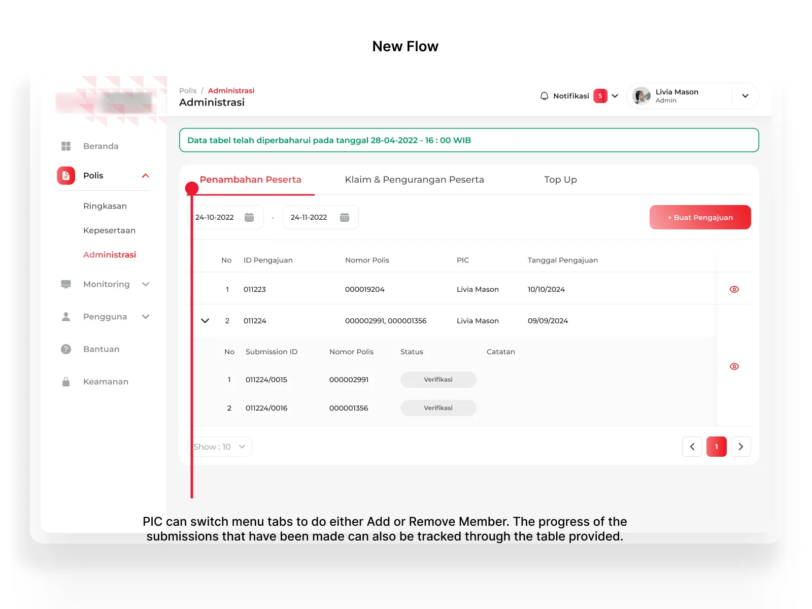
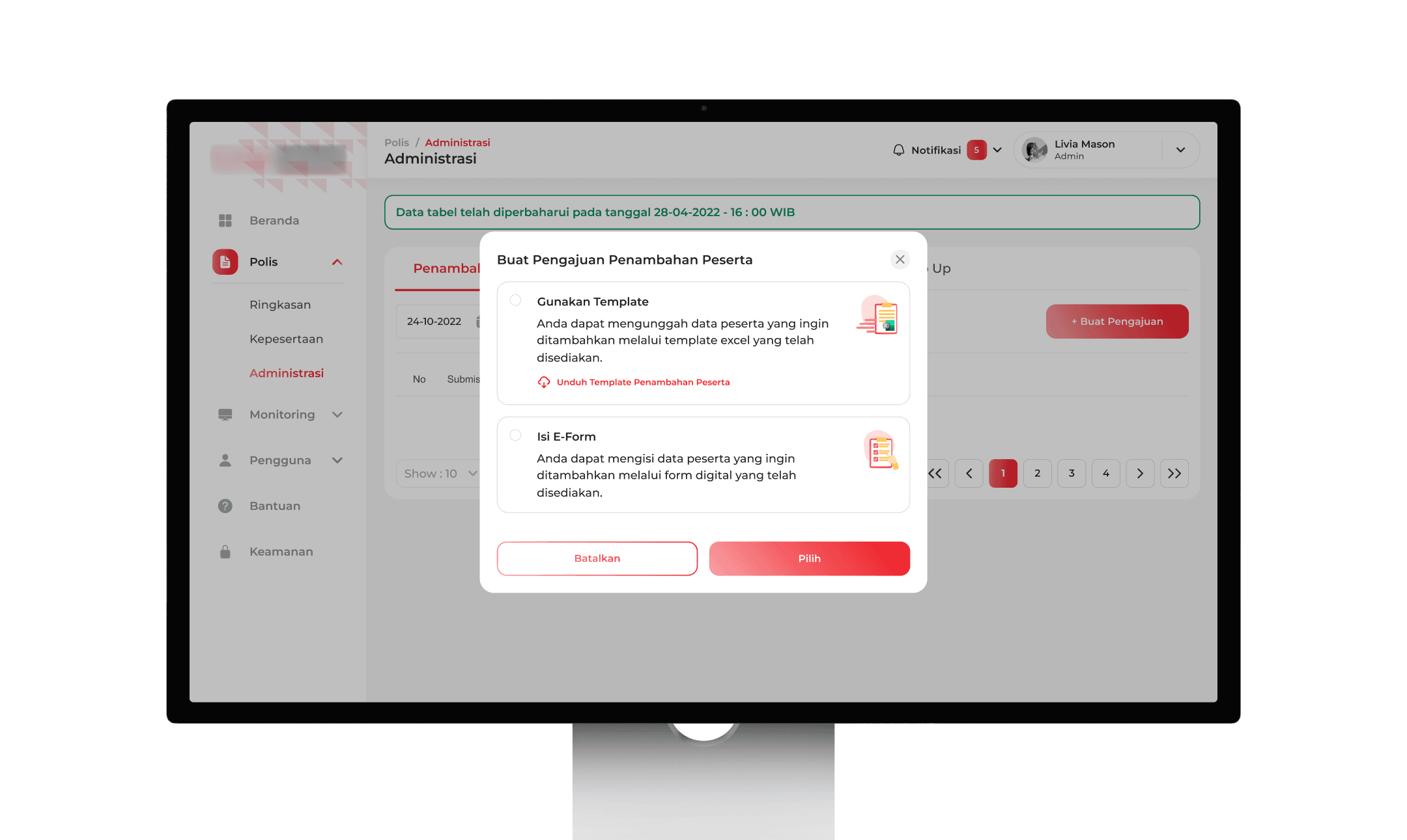
The original flow required PICs to select policy numbers before creating submission, which would made the actions very limited. I redesigned this by introducing an action-based navigation with "Add Member" and "Remove Member" tabs. Now, PICs can immediately access the function they need and select their policy in context. This shift from policy-first to action-first navigation aligns the interface with users' actual workflow.
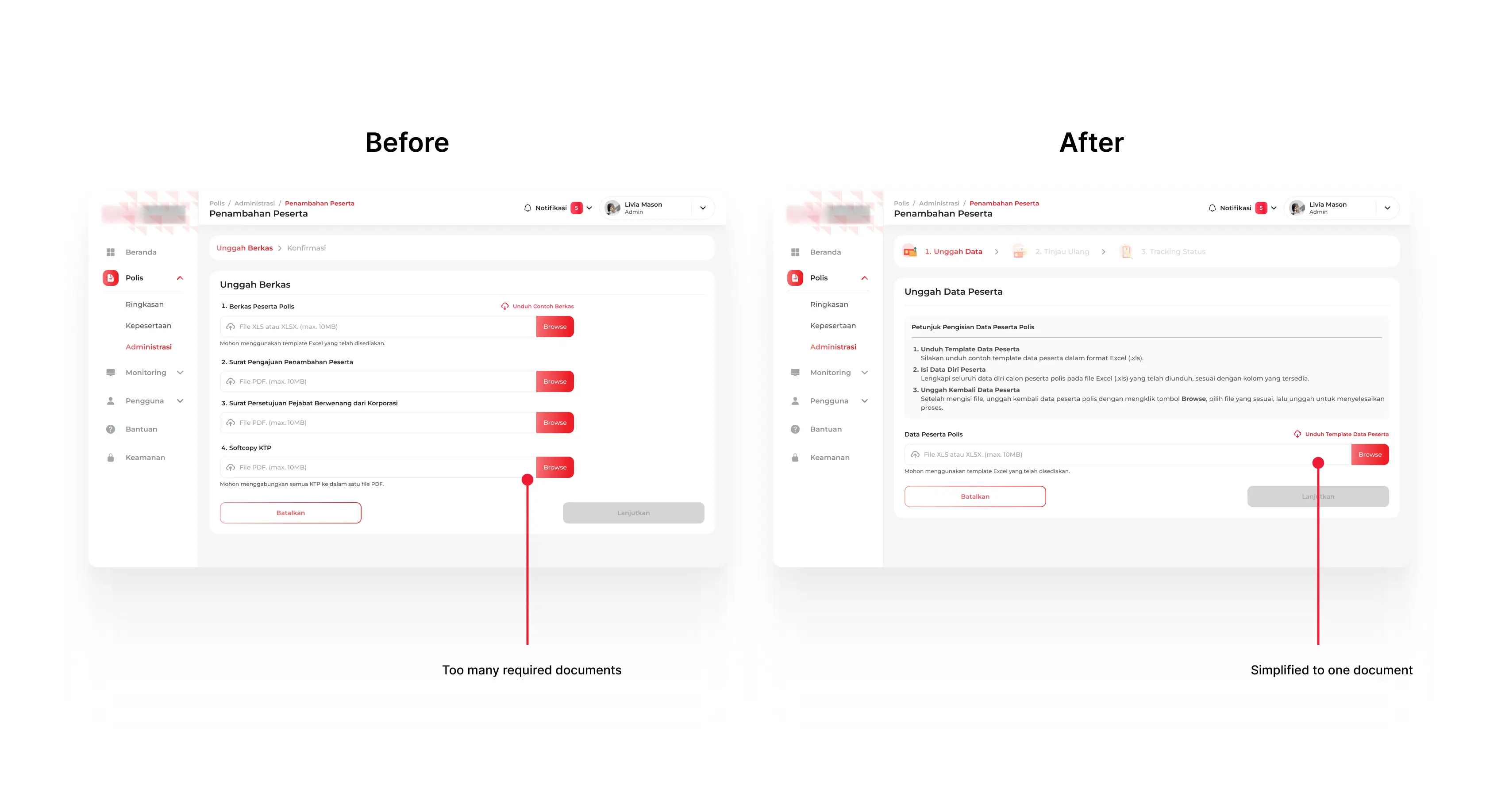
By analyzing the original requirements, I eliminated three redundant documents, consolidating everything into a single upload. This reduces preparation time for PICs while maintaining all necessary data.

To accommodate various use cases, I made two options: a bulk template upload for large submissions (100+ participants) and a digital e-form for smaller batch of participants. This flexibility ensures PICs can choose the most efficient method.
I redesigned the progress stepper with 3D assets made by our 3D Designer, creating clear visual waypoints that help PICs navigate the multi-step process easily.
Result
This app serves 300+ monthly active corporate users, with member management features among the most-used sections (5,500+ page views in September 2025). While feature-specific analytics are limited due to the B2B nature of the tool, the redesign successfully eliminated key pain points: reducing redundant documents, introducing flexible input methods, and adding cost transparency before submission.
Reflections & Next Steps
Post-launch feedback revealed that some users needed guidance with the new flexible options, revealing an opportunity to improve onboarding materials.
Plans for further iterations may not be a priority at this time, but if they become so in the future, I'll add few things to be used as information for users such as in-app tooltips explaining when to use template or e-form, enhanced help documentation for common questions, or maybe creating interactive walkthrough.
This project taught me to balance user needs with business goals, make design decisions without perfect data, and collaborate effectively across teams.
🍀