Digitalizing Food Ordering with MealMates
A test challenge where I only got 3 days to create case study about Food Ordering App
2023
UI
UX
Exploration
Mobile

Project Overview
Client: Small Restaurant in South Jakarta
Industry: Food & Beverage
Timeline: 3 days
My Role: UI/UX Designer
Problem Statement
A restaurant in South Jakarta can serve only a limited number of people at a time, resulting in long lines as the norm. Currently, there's no system in place to engage or reward loyal customers.
Objectives
The app's purpose is to create a platform with these primary features: ordering food for dine-in or takeaway, browse and customize, and earning points from purchases.
Design Process
Task Breakdown and User Demography
Since my time is limited, I don't have much time to go through ways I currently do when I'm designing real applications for projects, but I tried to breakdown current problem the restaurant is facing so what will be created only focuses on few problems and user:

Competitive Research
To initiate the product design process, I conducted competitive research on several food delivery applications, including GoFood, Shopee Food, McDonald's app, and Pizza Hut app. These apps are popular choices during lunch hours. Each application offers unique features with their own strengths and weaknesses.

From this analysis, the key differences between these apps lie in their benefits. McDonald's App and Pizza Hut offer rewards to their customers, whereas GoFood and ShopeeFood only serve food purchases without rewards. Pizza Hut offers more comprehensive features, although its main menu is simple without too much content.
User Flow

Sketching Wireframes
With a solid foundation in place, I moved on to sketching wireframes. This step gave me ideas about the app's content before diving into high-fidelity design. It was essential for visualizing the app's flow and layout.

User Testing
Before handing my final result to the recruiter, I tested my design using Maze to few of my acquaintances to see if the application I created can be understood and used easily. The results are below:
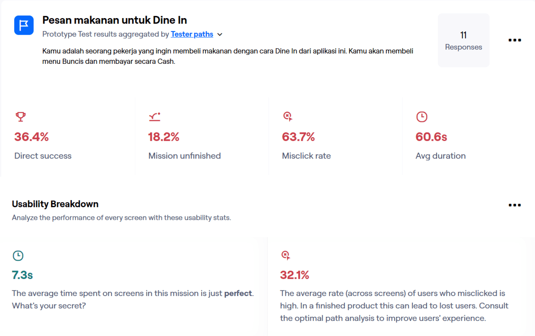
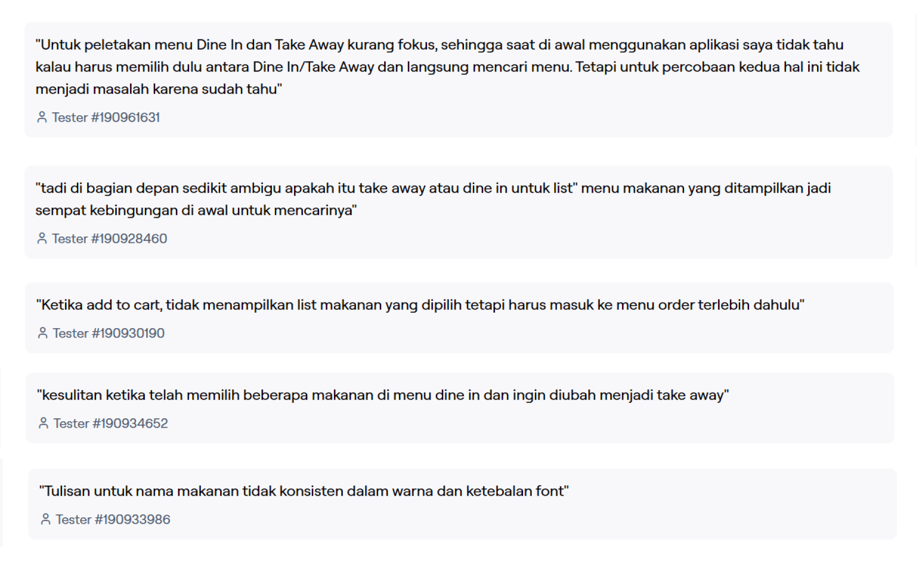
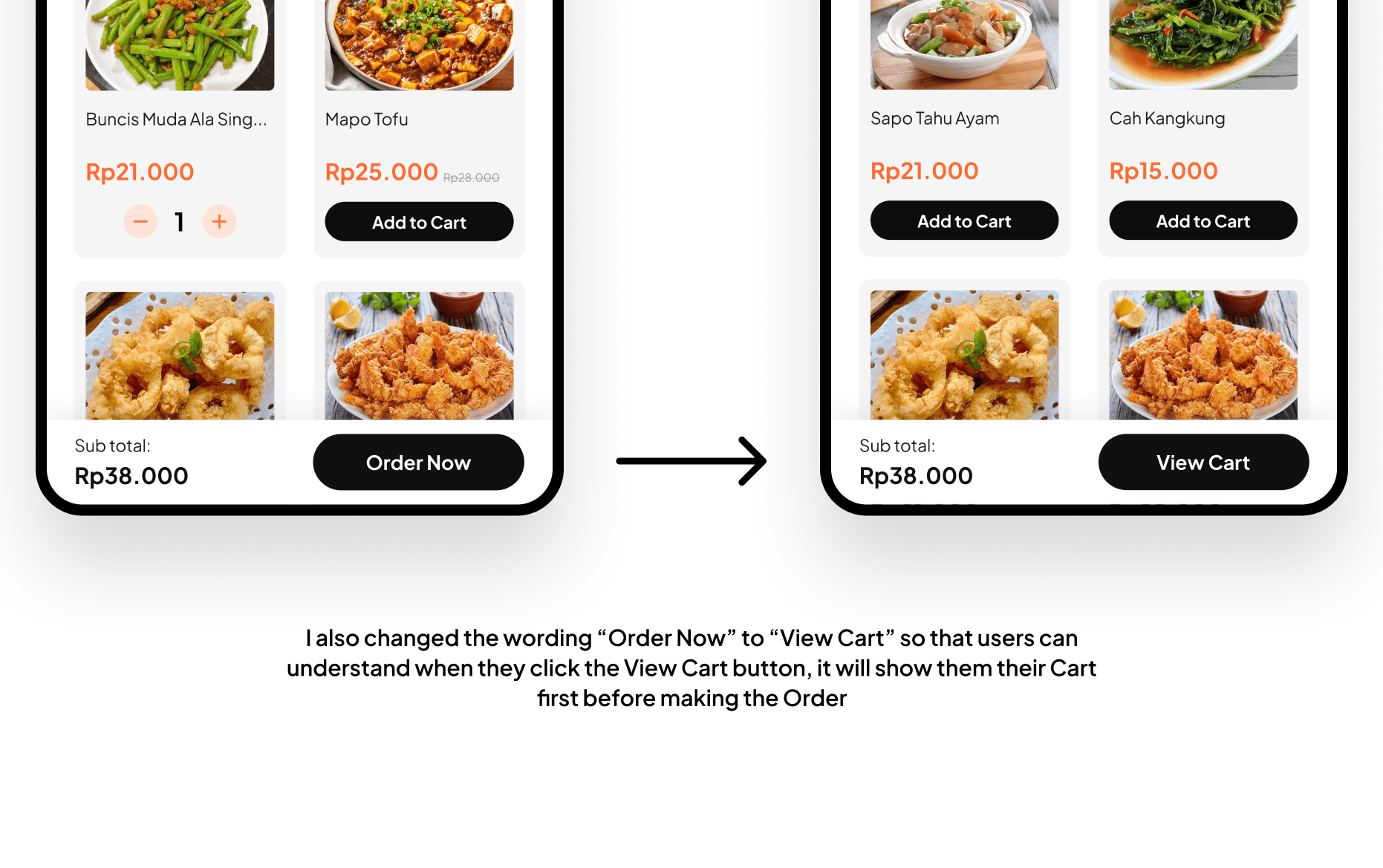
From the results and feedback above, I can see that some users are confused mostly in Homepage because the Dine in and Takeaway menu wasn’t highlighted properly. They also thought that the section in Homepage is confusing.
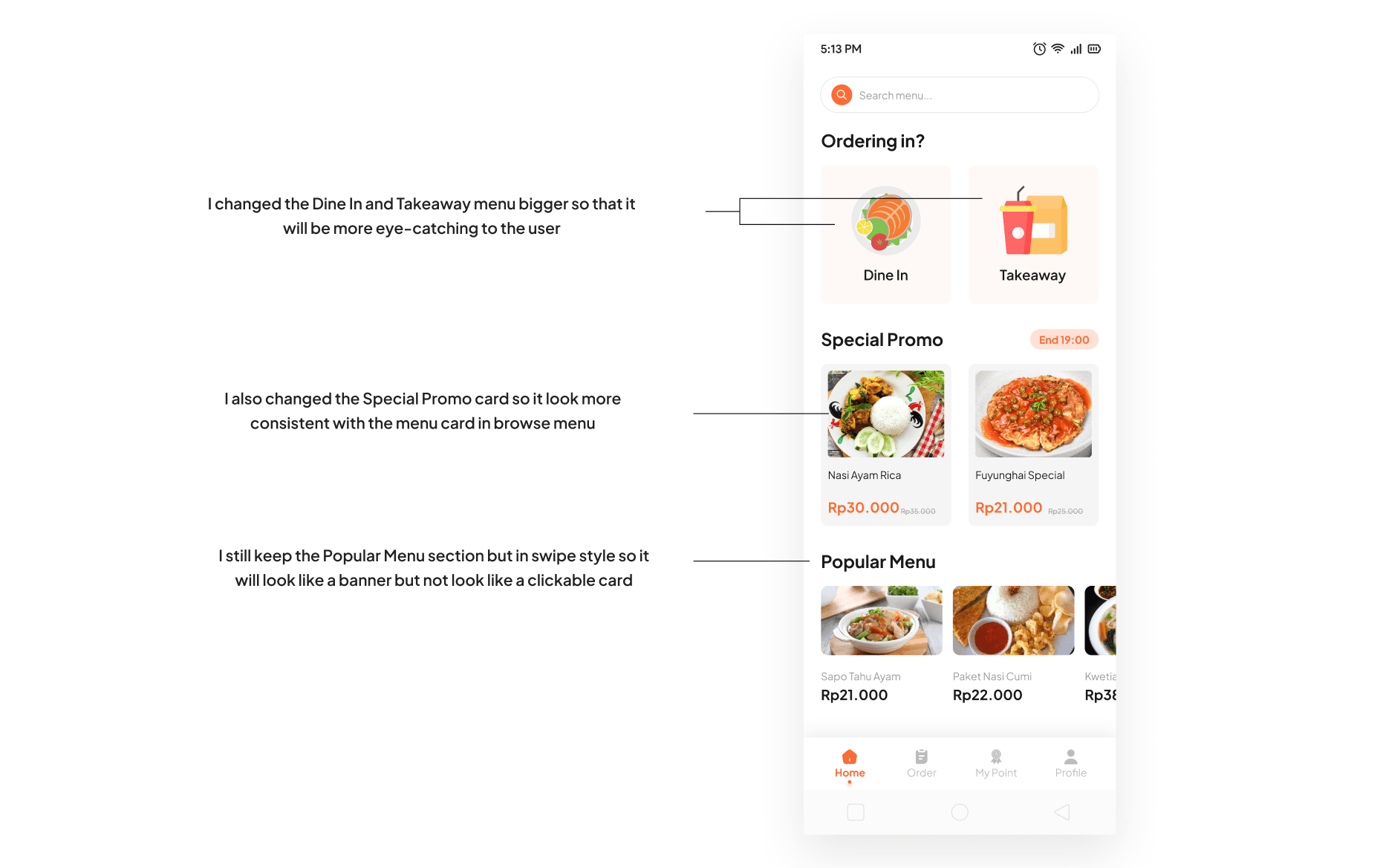
Iteration
Thanks to the feedback, I was able to iterate what might have caused the user confused.
Feature
Ordering Food
Customers can choose between dine-in or takeaway options. The homepage also displays information about promotional menus, popular dishes, and the customer's last order. To order, customers must scan a barcode before they can select menu items. If the restaurant is full and there's a waiting list, the app will ask customers if they want to wait or opt for takeaway instead.

Browse and Customize Menu
Customer can browse for menu, the menu is also categorized by recommended menu and menu type (package, chicken, meat, etc). They can add more item for the menu, and adjust menu to their liking. After the menu is picked, customer can add another menu or click Order Now if they have finished selecting the menu.

Earn Points
Customers will get points every time they make an order via application. They can check their current point in menu My Points. There are progress badges and if customers have reached certain milestones they will get benefits.

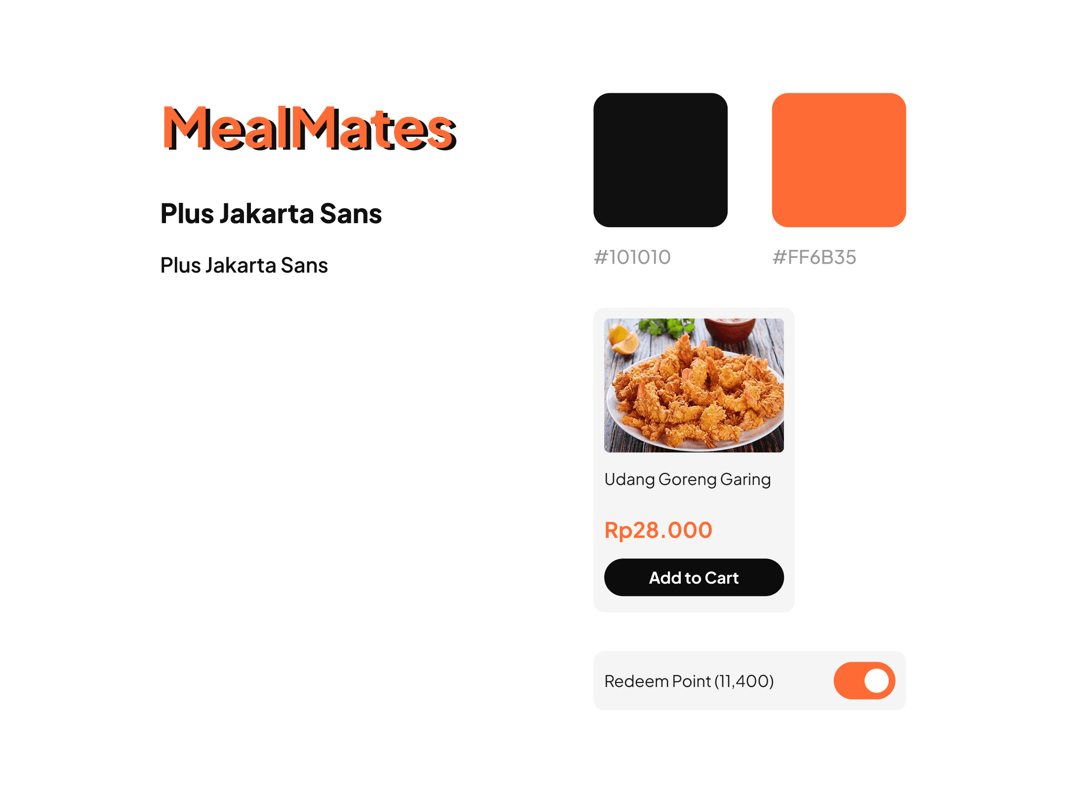
Components Guide
Even though this is just an assignment required to a job that I was applying, I still made a style guide so I can create more consistent design.
Key Takeaways
Validating design decisions through research or user testing is crucial for ensuring that the final product meets user needs. Surveys and market analysis provide insights into user preferences and behaviors, guiding the design process. User testing offers direct feedback from real users, helping designers assess usability and make improvements. By observing how users interact with prototypes or beta versions of the product, designers can identify areas for improvement and make iterative changes to refine the design. This process reduces the risk of assumptions and biases, leading to more successful, user-centered outcomes.
By this test I realize that it's super important to listen to the people who will be using what you're making. By conducting test, we can hear what users have to say, thus we get really helpful info about what they feel and what they don't like when they use the app. This helps us make things that fit their needs better. By paying attention to users, we can create better design that is intuitive and easy to navigate.
🍀